
“Any discussion of success at Charles Schwab should start with a description of our strategy through client's eyes
which is the foundation of everything we have achieved.”
– Walt Bettinger, CEO and President
Charles Schwab is a different kind of investment firm – one that strives to disrupt the status quo of the traditional Wall Street approach. Making investing more affordable, accessible, and modern.
My role focused on the onboarding experience (Open Account) for web and mobile app.
The Problem
The online open account experience first launched in 2014. Since then it has performed well, but wanted to re-evaluate and further improve the experience to stay competitive in market. The main challenge was tackling 4 big areas:
• Fix usability issues. Improve user flow.
• Attract and retain clients. Make it easy to open accounts.
• Get accounts funded.
• Help onboard new clients and start their financial journey with Schwab so they can achieve their financial goals.
My Role
Sr UX Manager, Lead designer
Research
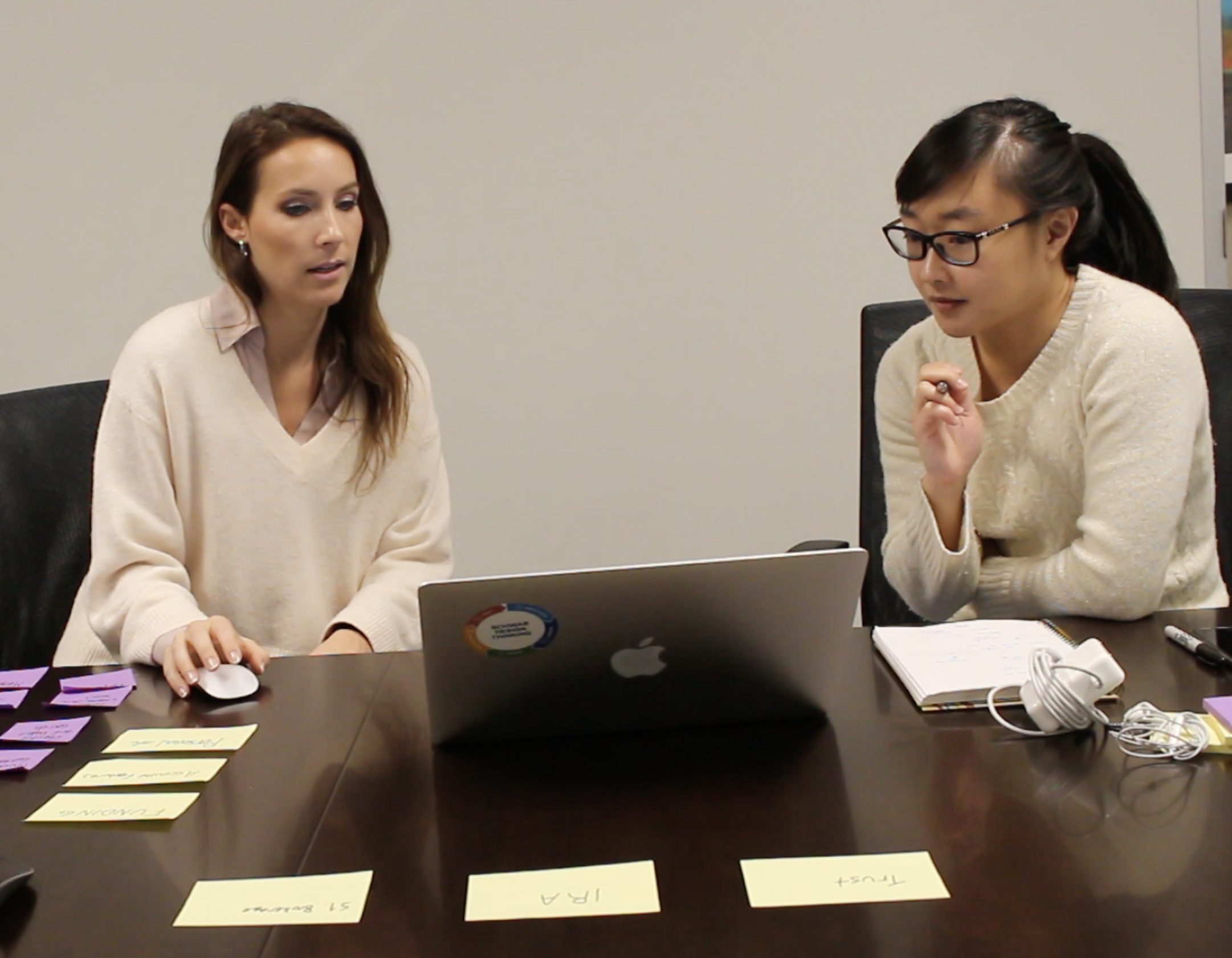
The research team did everything from ethnography to usability testing. We also had marketing, data & analytics (ABI) team, and competitive intelligence so we had data and research from a variety of sources. (#datatriangulation) As a UX designer, I worked closely with our research team. Sometimes, I would do my own research as well. This is one example where I am enlisting the help of my co-workers who are Schwab clients. I created an axure prototype to do a cognitive walkthrough. We also did some card sorting to understand how they picture the flow.


Journey Mapping
Journey mapping is a way to walk in the client’s shoes and understand their painpoints and delights across . I've facilitated journey mapping workshops and ideation session throughout this project. I've also trained and educated design thinking to UXers and our partners.
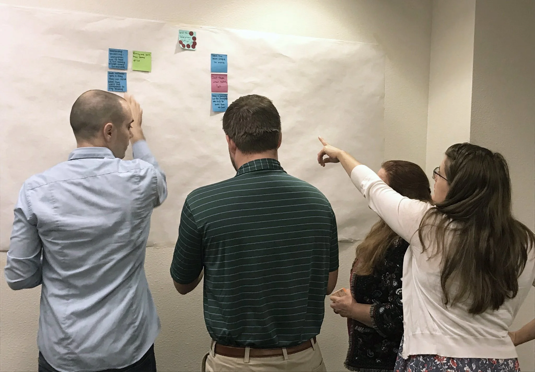

Remote Workshop
Our team spread across 4 different cities (SF, Austin, Chicago, Phoenix) and were able to collaborate virtually using tools like Mural. The image shown here is from a journey mapping session where we had about 40 people–a diverse product team ranging from product owners, designers, developers, marketing, etc. We spent 2 days with 3 hours each workshopping (typically takes 3 days) and mapping out the client onboarding experience.
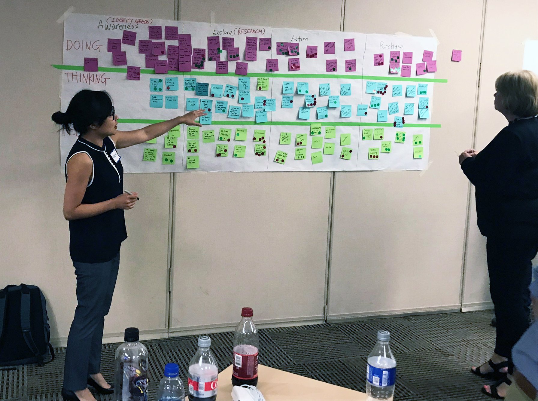
Insights into Action
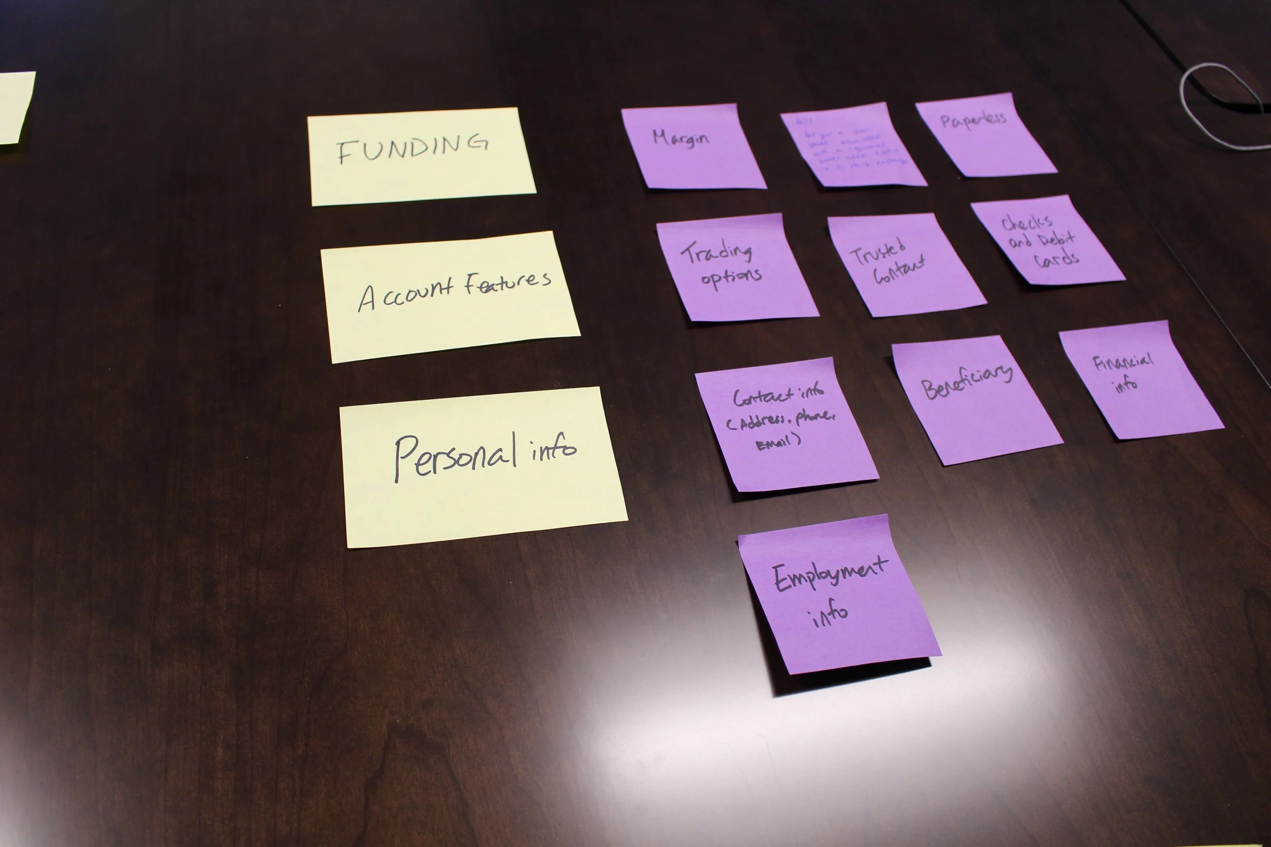
From the journey mapping workshop we had a lot of great feedback from internal employees, clients, and advisors. Taking those inputs and learning about the painpoints and opportunities was our next step. We synthesized the data using affinity mapping and from there, identified a couple of key themes which we then mapped in a 2x2 matrix to determine the feasibility vs value and prioritize. Ultimately, we had a roadmap of now, next, later items and a JIRA backlog of opportunities.

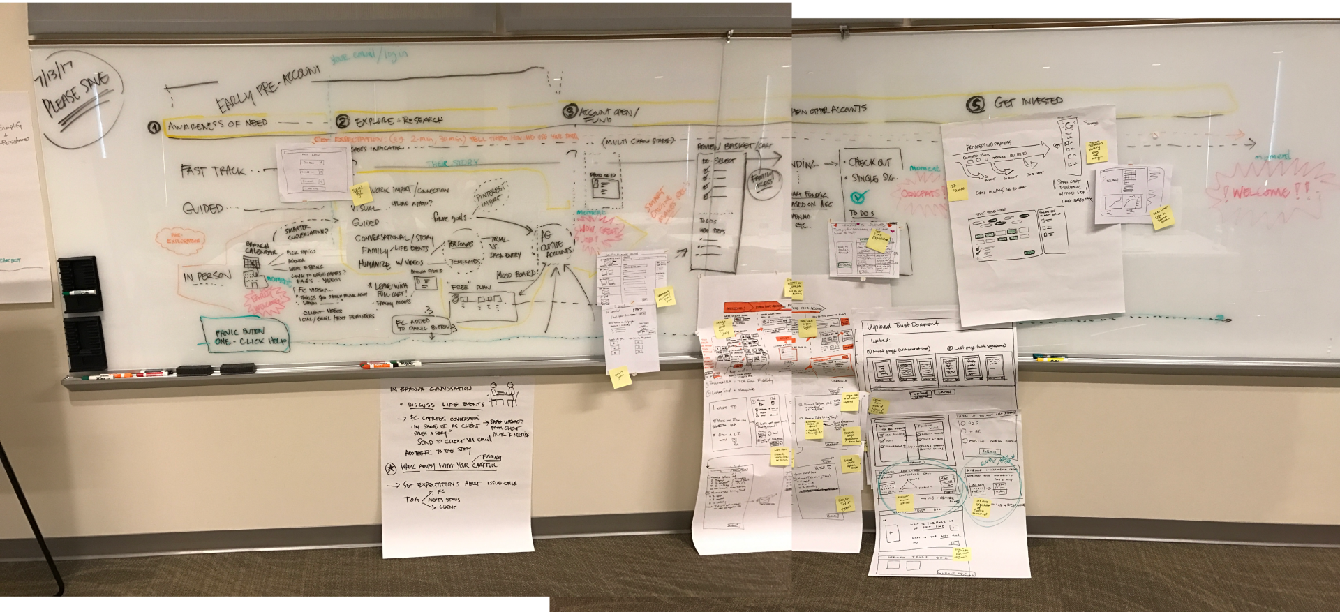
Mapping User Flows
With all the data analyzed, collected and synthesized, it was time to identify the problem areas within the existing experience and reimagine a more streamlined, easier process. Understanding the backend systems and what limitations there are was also important when designing. Working with our tech partners, I looked for reusable patterns and common modules throughout this flow and elsewhere. These are called utilities.

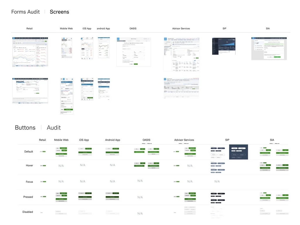
Design System
Standardizing designs and ensuring consistency throughout the different platforms and channels is important for any enterprise company. As the company scales and hires more designers, having a design system in place helps the brand come together as one cohesive experience. I've been designing for standards for a long time and was happy to help continue to build Schwab's standards. I created a stickersheet with symbols that were reusable and easy for other designers to use on their projects. I also worked on numerous standards projects to improve and modernize the components UI and fix design debt.


Accessible Forms
Forms are the primary UI for the online application process so it was imperative to have the best-in-class, accessible forms. We made sure that all UI controls and texts were legible, passed color contrast, and accesible from any browser or platform. We tested using screen readers (JAWS), etc. to make sure even blind people could use it. We also ensured that everything was mobile friendly. All the input controls, buttons, etc. had touch target sizes that were at least 44px. I created the specs so developers could implement the designs.
Audit
Sounds nerdy, but audits are one of my favorite things to do. It gives me a birds eye view of everything.
Conversational UI
One of the things we explored was around conversational UI. When clients come to Schwab to open an account in the branch, the first thing a representative would say is "Hello" and ask what kind of account they want to open or where they are in their investment journey and what they're looking for. It always starts with a conversation. We wanted to mimick that feel in a digital way.


Design Prototype
After much sketching and explorations, we whittled down to a handful of strong concepts we wanted to protoytpe and test. The tools we used for this was Sketch and Invision. The prototypes ranged from low to high-fidelity. As we matured into our product phase, the more refined the prototypes were. Each time we received feedback, we tweaked the design to make it better and better.
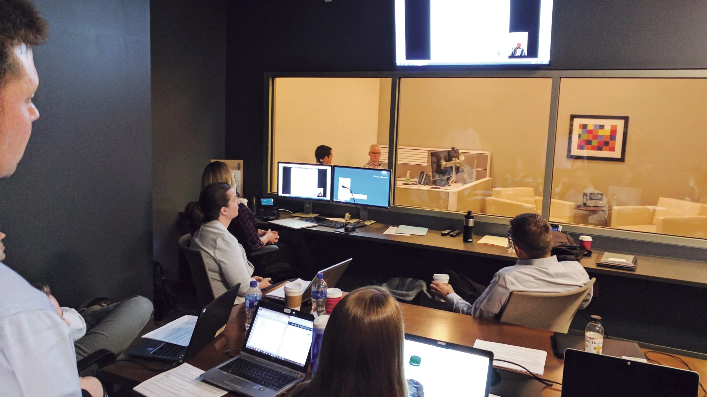
Test, test, test
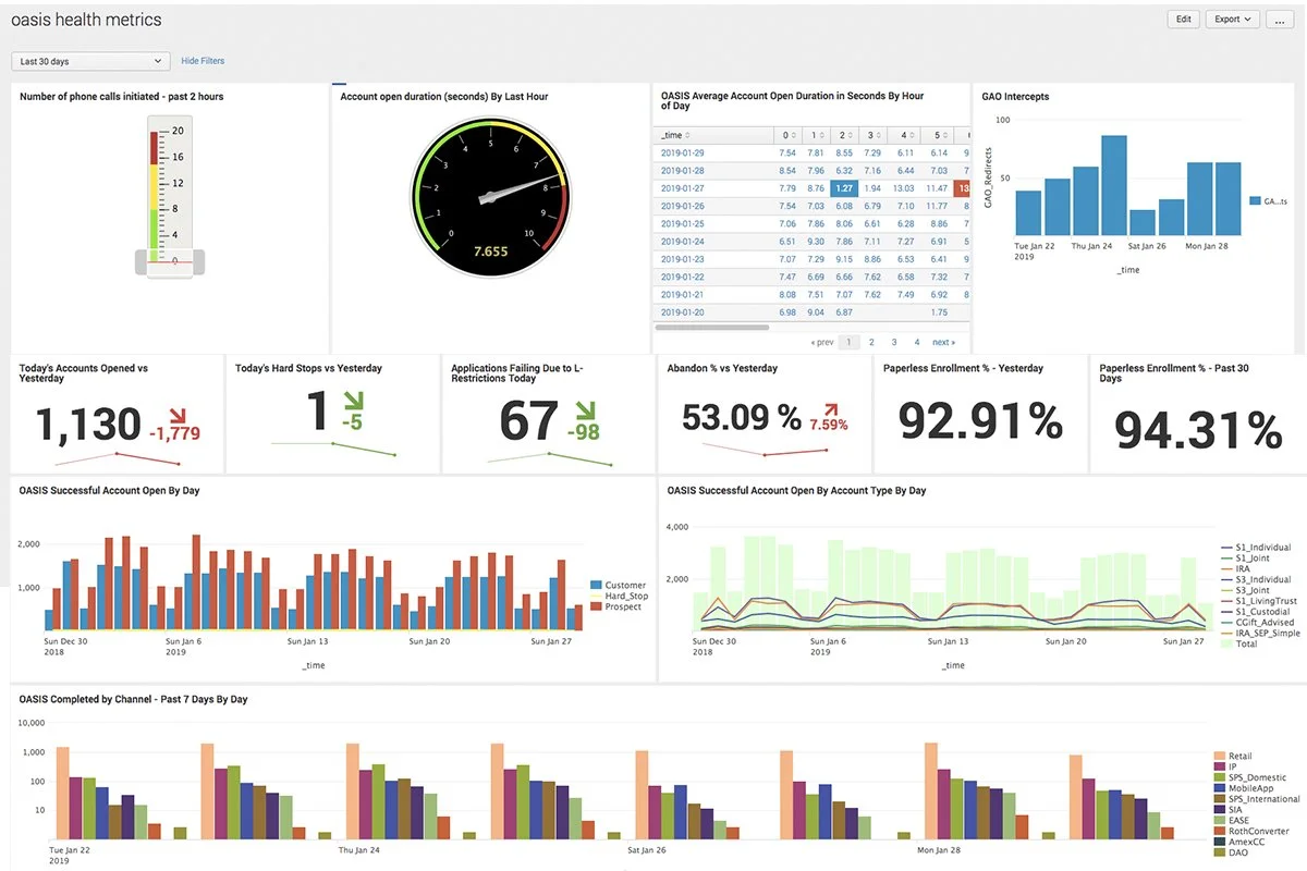
Working with the research team, we tested early and often. Every sprint, we had an experiment and tested our prototypes infront of users. The entire product team was invited to these "watch parties". We would have popcorn and everyone would listen to user feedback first hand and take notes. Decisions were made in real-time and we iterated sometimes even during the testing–no waiting around for a read-out. Besides UX research, we also worked closely with data analytics team who monitored live data results such as click rate and impressions. We would analyze those results in a weekly meeting.
“"It was SOOO easy to open an account.
Took less than 5 minutes."”
Key Impact
-
73%
reduction in call volume
-
60%
straight through processing
-
33%
conversion to funding