MattressFirm.com is being redesigned as the backend technology is undergoing a platform change from SalesForce to Microsoft D365.
Since last year, the new site development has been underway and is slowly rolling out.
The Why behind the new site:
• Omni-channel
• Modernization
• New features and UX/UI improvements
Historical Context
In just over 30 years, Mattress Firm has grown into a leading nationwide retailer, with 2600 stores nationwide and a workforce of thousands of Sleep Experts.
While their in-store sales have consistently been strong, Covid has definitely impacted their sales figures and there has been a bigger focus on e-commerce.
My Role
Sr. UX Manager, lead design
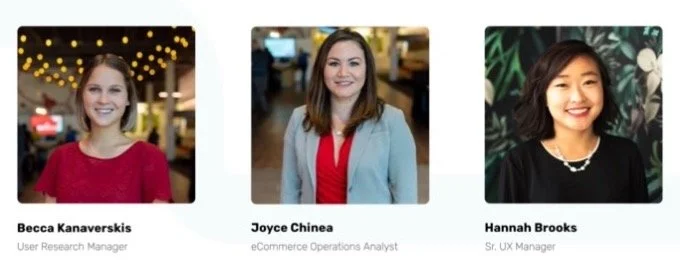
Team
UX Squad: 3 designers, 10-20 engineers, 1-4 PMs, 1 UX Researcher, 1 A/B tester
Data analysts, SEO specialist, 1 Director, stakeholders,
Brand/Marketing
External Agency Partner: Droga5
We have a problem, America
Bad sleep is a chronic, widespread issue in America. Studies have shown that 2 out of 3 people are sleep deprived. MattressFirm is on a mission to help with this issue and become America's #1 trusted authority on sleep. The marketing team partnered with Droga5 to launch the campaign "JunkSleep". There was a TV spot during the Olympics, social media, and other PR. My UX team focused on the digital experiences.
Similar to the JunkSleep campaign, there was another workstream that was more content focused – Sleep Disruptors. Most common types of sleep disruptors are chronic pain, such as back pain, sleep apnea, etc. MattressFirm's sister site, Sleep.com has articles on Sleep Disruptors and we wanted to bring those into mfrm.com but with a sales focus.
Goal
Provide inspiring, educational content by curating not just the best selection of mattresses but also providing an unparalleled level of expertise and guidance for sleep wellness, we will help consumers through their journey to better sleep.
UX Process
I use a user centered and agile process throughout the product development lifecycle.

The full process, mapping inputs and outputs, served as a loose checklist for the team, ensuring quality and rigor
Research
RIA: Research, Insights and Action
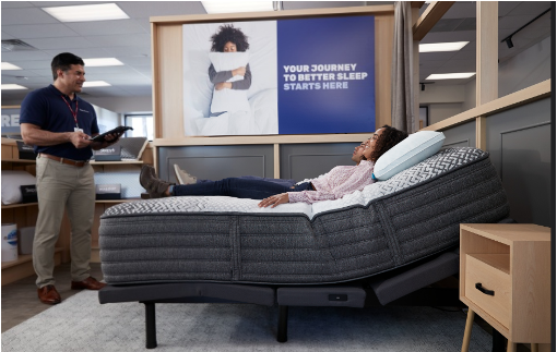
Shadowing
Shadowing Sleep Experts at the local stores was a great way to see how they educate and recommend products to customers.

To start the information gathering process, I reached out to SMEs to do stakeholder interviews, and worked with our data analysts and researcher. Data from MattressMatcher quiz was pretty useful – it told us the top 2 sleep disruptors (1. pain 2. sleep apnea). We also ran unmoderated user research tests using usertesting.com.
3 key takeaways from the tests:
• When asked "Where would you go to the site to learn more about how to get better sleep?" There was a 4-way split between the SleepScore Labs page, Unjunk your Sleep Landing Page, MattressMatcher quiz, and Discover Guides and a few participants answering Help/Chat.
• The Sleep.com Sleep Disruptors page overwhelmed participants with the quantity and length of content and links that go to more articles. Mainly, their goal was to see a connection between their sleep needs and a mattress that will address them. Being able to sort by top picks was a request feature.
• Participants recommended having more pages on mfrm.com focused on sleep disruptors/needs since back pain was the only one they could find, and possibly having MattressMatcher tailor to sleep needs as a 'sleep diagnostic' tool as opposed to just a mattress selector.
Competitor Analysis


User Flow
The idea was to create a centralized hub for all the sleep disuptors and map out the user journey that allows for easy navigation and organization.

UX Wires
We wanted this landing page to be a guided shopping experience that is tailored to their personal needs. The products are organized in a clean and clear manner but there is an overall content strategy that is about being educational and not overtly sales-y.
From a back-end perspective, we wanted to develop a reusable template that will be easily customized and updated and thus saving operational time and creating efficiencies organizationally.
Design


Outcome

A/B test results showed immense lift in PLP page views as well as improvement in exit rate and bounce rate with the new designs.
After the new pages were developed, we slowly rolled out to traffic to 40% and saw promising results. The new experience increased conversion by 34.5% and AOV by 29%.
29%
AOV
34.5%
CVR
Reflections
I am humble and grateful to have led design with such talented superstars and to have worked with a top-notch agency, Droga5.
In the short amount of time, I am proud of the small wins and strides I have made here: spear heading the new design system, growing the research practice, and fostering a solid design culture and foundation. From defining the UX process, how we work, to executing and delivering quality, world-class work has been tough but rewarding.
Future improvements
Would like to do another round of testing. Only had time to do one user test because of the tight timeline, but hoping to take the learnings from this one and use it to do another test. Also would like to explore more innovative solutions like AR.